
Ever wonder why some photography websites just draw you in while others feel cluttered or bland?
Choosing fonts feels easy, until it’s time to do it for a real portfolio. Many photographers spend hours scrolling font lists, still unsure if the site reads “creative professional” or “cheap blog.” Here’s what’s real: best free font pairings can make or break your photography website’s first impression.
Fonts quietly shape the mood of a portfolio site. They’re not just decoration—fonts create the vibe. If headlines shout while body text whispers, or pairing clashes instead of blending, visitors pick up the confusion in a split second. That’s when most will click away. But if the font pairing feels effortless and balanced, the site instantly feels more modern, professional, and stylish—no paid design agency needed.
Why Font Pairing Matters for Photographers
Font pairing drives many creators nuts for one simple reason: the details matter. A bold, clean main font paired with an easy-to-read, softer text keeps the focus on your images. The pros have been using this formula for years to stand out. Now any photographer can use free font combinations and step up their site’s look.
Finding the best free font pairings that transform photography websites is all about:
- Limiting your choices: Two or three fonts max does the job.
- Mixing for contrast: Pair a serif with a sans serif, or grab two contrasting weights.
- Checking across devices: What looks good on desktop needs to shine on mobile.
- Prioritizing clarity: Headlines should pop. Long text should feel easy on the eyes.
Keep these best free font pairing strategies front and center, and the site will make the right statement—every single time.
Best Free Fonts Pairing for Photography Websites
Looking to give your photography website an instant style upgrade without the hassle? These trusted free font combinations will save you time and help you create a stunning, modern portfolio with ease. Skip the endless scrolling and discover pairs that really work.
These best free fonts pairing for photography websites are favorites among pros and beginners alike.
Flaviotte and Geist

Flaviotte and Geist is a duo that hits the sweet spot for many photographers.
Flaviotte is a playful, serif display font. It grabs attention with its unique, bold style—perfect for headlines that need to stand out. Its quirky, human touch adds personality, making your brand feel approachable and fun.
Geist is a clean, geometric sans serif that balances Flaviotte’s boldness. It’s highly readable even at smaller sizes, ideal for body text and captions. Geist’s modern simplicity keeps the site polished without competing with your photos.
Milky Walky and Archivo

Milky Walky is a soft, sans serif font with a friendly vibe. It grabs attention with its unique, whimsical shapes—perfect for headlines that feel approachable and fun.
Archivo is a strong, versatile sans serif designed for readability. It works great for body text and captions, giving the site a neat, polished look without stealing focus from photos.
This combo balances playful style with clean professionalism—two things every photography site needs. Together, Milky Walky’s playful headlines paired with Archivo’s clear, easy-to-read text create a smooth visual flow that helps visitors quickly scan and comfortably digest content.
Moniqa and Libre Baskerville

Moniqa is a variable typeface with a fresh, contemporary style. It works great for headlines, adding personality and a unique touch to your site. Its clean lines keep things stylish without overpowering the photos.
Libre Baskerville is a well-crafted serif font. It’s designed for easy reading, making it perfect for body text and detailed descriptions. Libre Baskerville brings timeless elegance and balances Moniqa’s modern edge.
Together they create balance and offer modern and traditional styles that suit creative portfolios.
Download Libre Baskerville Font
Mango Grotesque and Roboto

Mango Grotesque and Roboto are an ideal best free fonts pairing for portfolio websites, supporting standout visuals and clear communication every step of the way.
Mango Grotesque is bold and dynamic, working best for eye-catching headlines or project names. Its variable weights and condensed style bring energy and a custom vibe to each page.
Roboto is a classic—clean, super legible, and friendly on any screen size. It’s perfect for descriptions, captions, or lengthy case studies.
Chillax and Lato

Stressed about finding the right fonts for a photography website that feels fresh but stays easy to read? Chillax and Lato deliver a look that feels relaxed yet totally professional.
Chillax brings a friendly, laid-back vibe to big headlines or banners. It’s soft, modern, and stands out without being overwhelming.
Lato is a clean, super-readable sans serif perfect for all your body text, captions, and details. It keeps things neat, helps visitors focus, and works on every device.
Satoshi and Karla

Satoshi and Karla fonts are modern, flexible, and easy to pair—great for showing off visual work.
This pairing works because Satoshi brings clear structure while Karla adds just the right touch of personality, making each section stand out. Both fonts are easy to read on any screen, so visitors instantly feel comfortable scrolling through content. Together, their modern look fits minimalist and editorial portfolio sites, and with Satoshi catching the eye in headlines while Karla keeps the details welcoming, the entire flow feels natural and engaging.
ZT Nature and Crimson Pro

Curious if ZT Nature and Crimson Pro are the right fit for a photography website? This pairing mixes modern energy with classic style—both key for a memorable online portfolio.
ZT Nature brings a geometric, sans serif edge to headings. It stands out for hero titles and navigation, grabbing attention without overpowering images. ZT Nature’s bold shapes highlight creative work and establish a clear hierarchy.
Crimson Pro is a refined serif font made for readability and elegance. It’s perfect for body text, captions, and any spot where details matter. Crimson Pro provides warmth, polish, and keeps everything feeling professional.
Archia and Merriweather

Archia and Merriweather give photography websites a polished, professional feel that highlights both images and content effortlessly.
Archia is a clean, geometric sans-serif great for headlines and navigation. It brings clarity and structure without being too stiff or cold. Perfect for grabbing attention with bold statements.
Merriweather is a classic serif font designed for screen readability. It works beautifully for longer texts, captions, and photo descriptions. Merriweather’s subtle curves add warmth and sophistication.
Emberly and Inter

Emberly offers a distinctive, modern style with unique character shapes. It shines in headlines and titles, creating eye-catching focal points without being overpowering.
Inter is a highly legible sans serif loved for body text and UI elements. It’s crisp, neutral, and looks great on all screen sizes, helping keep longer text blocks comfortable to read.
Gotemika and Noto Sans

Gotemika is a versatile display font that brings personality and flair to photography websites. Its bold shapes and unique letter forms make it perfect for headlines and titles, grabbing visitor attention without overwhelming the design. Gotemika adds a creative, artistic touch that can give portfolios a distinctive edge.
Noto Sans is a clean, modern sans-serif font designed for readability on all screen types. It works beautifully for body text, captions, and menus, helping visitors easily digest information without distraction. Noto Sans supports clear communication with a neutral tone, balancing Gotemika’s bold style perfectly.
Loki and Raleway

Loki is a playful, sans-serif script font that adds personality and charm to portfolio websites. Its hand-written feel makes headlines look friendly, approachable, and creative. Loki works great for banners, logos, or anywhere a relaxed, artistic vibe is needed.
Raleway is a clean, elegant sans-serif font designed for readability and style. It shines in body text, navigation, and subheadings, balancing Loki’s casual flair with professional clarity. Raleway supports smooth reading experiences on all devices.
TG Movita and Nunito

TG Movita is a stylish, modern font with unique curves and a fresh feel. It’s ideal for headlines and titles, adding a touch of sophistication and flair to any photography portfolio. TG Movita captures attention without overwhelming the images, making it great for creative branding.
Nunito is a friendly, highly-readable sans serif with rounded terminals. Perfect for body text and captions, it offers a warm and approachable vibe that keeps visitors engaged. Nunito’s clean design works well across devices, ensuring consistent readability.
Final Thought: Your Fonts Build Your Brand
Nailing the best free fonts pairing for photography websites pays off with every new client who clicks through your portfolio. Stick with these pairs, simple rules, and tools, and design confusion melts away.
Make your site say “pro photographer” from the very first glance—with fonts that fit your work and make your story shine.
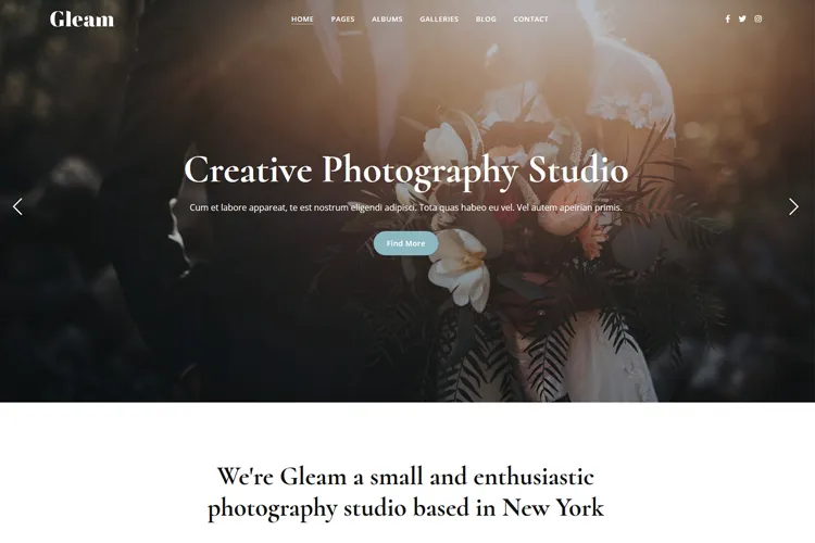
If you’re searching for a WordPress photography theme, check out popular options like Gleam, Tilia, or Iris. These themes comes with multiple portfolio and gallery options, are built with Elementor and easy to use. They help elevate your portfolio and build client trust.
Looking for more free fonts inspiration? Check our articles:
Best Fonts for Lawyer Websites
Best Fonts for Restaurant Menu Design
Note: Please check the fonts licenses as they may change over time.


